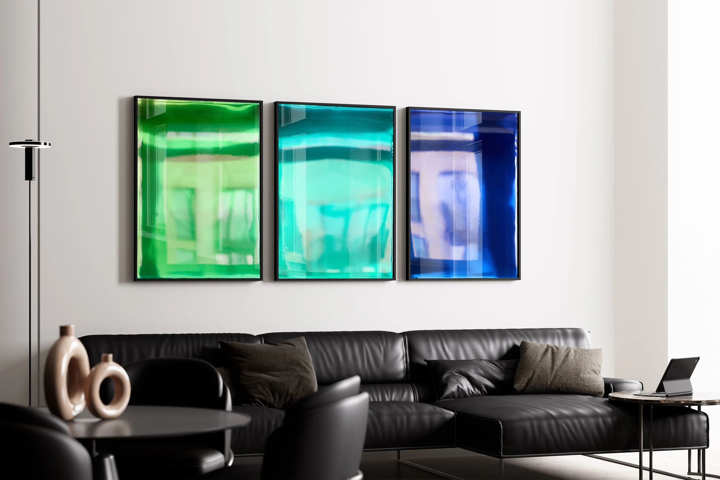
Blue Study
It All Begins Here
The colour that has to be earned
INTRODUCTION
My belief as an artist is that colour speaks to what the mind cannot name. That it moves us at a level that exists before language, before thought. Blue is where I find that claim tested most rigorously, and confirmed most completely.
Of all the colours in my practice as a contemporary abstract artist, blue demands the most. Not metaphorically. Literally. Blue has to be earned. The eye earns it. History earned it. Language earned it. And understanding why has shaped everything about how I approach it.
THE EYE EARNS BLUE
Blue is the hardest wavelength for the human eye to focus. Due to chromatic aberration, the eye's lens refracts blue light at a slightly different angle to other wavelengths, causing it to focus fractionally in front of the retina rather than directly on it. The eye has to actively compensate. It cannot take blue in passively.
This is not a weakness in blue. It is what gives blue its particular quality of depth. You cannot glance at it and move on. Blue pulls you in and makes you work for the experience. In that effort, something happens. The colour reaches you at a level that easier colours do not.
This is part of what drew me to blue as a medium in abstract painting. It is never merely decorative. It is always asking something.
HISTORY EARNED BLUE
For most of human history, producing blue required extraordinary effort. Ultramarine, the most prized blue pigment in the world, was ground from lapis lazuli, a semi-precious stone mined in Afghanistan. It was so rare and so expensive that Renaissance painters reserved it almost exclusively for the most sacred subjects: the robes of the Virgin Mary, the cloaks of archangels. To use blue was to signal that something mattered beyond ordinary measure.
Synthetic blue only became widely available in the nineteenth century. Before that, every blue in every painting represented an act of material commitment that few other colours required. Blue cost something. It always has.
This history is part of why the colour field movement found blue so compelling. For Rothko, Frankenthaler and Barnett Newman, colour was the subject itself, not the vehicle for something else. Blue, with all its historical weight and perceptual difficulty, was the most serious colour available. It carried everything that colour field painting was attempting to do: to create a direct, unmediated encounter between viewer and colour, bypassing representation entirely.
LANGUAGE EARNED BLUE
Blue was the last colour named in almost every language across human history. Languages consistently develop colour words in the same order: black and white first, then red, then other colours, with blue almost always arriving last.
The ancient Greek poet Homer, describing the world with extraordinary precision and richness, had no word for blue at all. He described the sea as wine-dark. The sky goes unnamed in terms of colour throughout his epics. This was not a failure of observation. It was a condition of language. Humanity could perceive blue long before it could hold it in words.
That gap between perceiving something and being able to name it is precisely the territory I work in as an abstract artist. Colour field painting exists in that gap. My spectral paintings exist in that gap. Blue is where the gap is widest.
THE PARADOX
Blue is simultaneously the world's favourite colour and the last colour humanity found words for. Survey after survey, across countries and cultures, blue comes first. It is the colour people return to, the colour they call their own. And yet it was the last to be named, the most difficult to make, the hardest for the eye to resolve.
I do not think this is coincidence. I think we love blue because it resists us. Because it never fully yields. Because it sits at the edge of what we can grasp: perceptually, historically, linguistically. And in that resistance, it speaks to something in us that other colours cannot reach.
WHAT THIS MEANS FOR THE WORK
My spectral paintings extend the colour field tradition into new territory. Where Rothko, Frankenthaler and Newman worked within the flat plane of the canvas, I build outward: layers of pigmented resin over a mirrored surface, a process developed specifically for this practice, through which colour gains depth, luminosity and the capacity to change with every shift of light and viewer position. The result is not observed colour but lived colour: colour that exists only in the encounter between the work and the specific person standing before it.
Three blue spectral paintings illustrate what this means in practice.
Secrets is rendered in a deep, near-black blue that sits at the very edge of visibility. In his blue paintings of the early 1950s, Ad Reinhardt pushed blue deliberately toward darkness, creating works that appeared, at first glance, to be near-monochrome. Only through sustained looking did the subtle variations of tone and structure reveal themselves. Meaning that withheld itself until it was earned. Secrets operates in that tradition. It is a blue that conceals as much as it reveals, that holds the duality of secrecy: what protects us can also confine us, and what is hidden shapes us as surely as what is seen.
Finitude is a pure, saturated blue in the lineage of Yves Klein, who devoted a significant body of work to blue as a complete philosophical statement. Klein registered International Klein Blue in 1960, a distinctive ultramarine formula that became the signature of his practice, treating blue itself as the subject of non-representational painting rather than a property of it. In Finitude, the blue arrived through pressure: built up through layers of cyan, ultramarine, violet and red through optical colour mixing until that specific hue asserted itself. A colour that earned its way into existence. Finitude is about what the awareness of limits does to us in the present: how knowing everything ends compresses time, sharpens attention, and makes deferral feel impossible. The blue carries that.
Authenticity moves into petrol-teal: a blue-green that has nothing left to prove. Not the pure saturated blue of philosophical assertion, not the near-black blue of concealment, but a blue that has resolved. Authenticity is not a declaration. It is the absence of resistance. The freedom that remains when there is nothing left to perform.
In each piece, the mirrored surface draws the viewer into the work. Their reflection is held within the colour field. They do not observe the blue from a distance. They enter it. What they experience is lived colour at its most complete: colour that cannot be passively received, that earns its meaning through the specific encounter between work and viewer, that speaks to what the mind cannot name.
This is why blue matters to me. Not because it is beautiful, though it often is. But because it demands something. Because it resists easy resolution. Because in the entire history of abstract art, no colour has made the eye, history and language work harder to possess it. And in that difficulty, in that resistance, blue speaks to what the mind cannot name with more precision than anything else I have found.
THE AUTHOR
Kohlben Vodden is a contemporary abstract artist whose spectral paintings extend the colour field tradition. Exhibited internationally including at Saatchi Gallery London, the British Embassy Paris, and the Qatar International Art Fair.
OBSERVED vs LIVED COLOUR
It All Begins Here
Colour as experience, not surface
A positioning essay for the practice of Kohlben Vodden
INTRODUCTION
Colour in this work is not a property of the surface and not a fixed visual fact. It is an event that happens between the work, the light in the room, and the person standing in front of it.
It does not exist in one place. It appears in the relationship between things.
Remove any one of these elements and colour collapses into something else. What remains is material, reflection, or memory. Not colour itself.
OBSERVED
Observed colour is how most people first encounter colour.
It is the assumption that colour is stable. That red is red. Blue is blue. That what you see is what the object contains.
This way of seeing is reinforced by reproduction systems: screens, print, photography, catalogues. In all of these, colour is fixed into a single outcome. It becomes something that can be recorded and repeated.
In this mode, the viewer is outside the process. The work is complete without them.
LIVED
Lived colour begins when that assumption stops holding.
In this work, colour changes depending on where you stand. It shifts with movement, distance, and angle. A small step can alter what is seen.
The work does not present a single image. It produces different colour states depending on position and light.
Here, the viewer is no longer separate from the work. They become part of what makes it visible.
OPTICAL COLOUR MIXING
The colour in these works is not created through physical colour mixing.
Instead, it is produced through optical colour mixing.
Layers of differently dyed resin are built up so that colour is not resolved at the level of material. It is resolved in the eye. Light passes through layers, reflects off mirrored surfaces, and returns to the viewer carrying combined colour information.
What is seen is not a single fixed pigment outcome. It is the result of layered optical interaction.
The colour is held in the structure, but completed in perception.
THE VIEWER
Each viewer produces a different colour experience.
The mirrored surfaces reflect the viewer back into the work. Light bounces off the viewer’s body, re-enters the piece, and is returned again into the space.
Because each person reflects light differently, each interaction produces a slightly different result.
What someone sees is not only determined by the work itself, but by their position within it.
In this sense, colour is not shared in a fixed way. It is generated uniquely in each encounter.
No two people stand in front of the same colour.
COLOUR
Colour in this work is not stored in the material and not fixed in advance.
It is produced through the interaction of optical colour mixing, reflective surfaces, and the presence of the viewer.
Outside of this interaction, colour does not fully exist. There is only material, light, and reflection waiting to be completed.
CLOSING POSITION
This work is not about representing colour more accurately.
It is about showing that colour is not stable in the first place.
Between OBSERVED and LIVED is the moment where colour stops being assumed and starts being produced.
That is where the work takes place.